Senior Project Process (2024)
May 6th
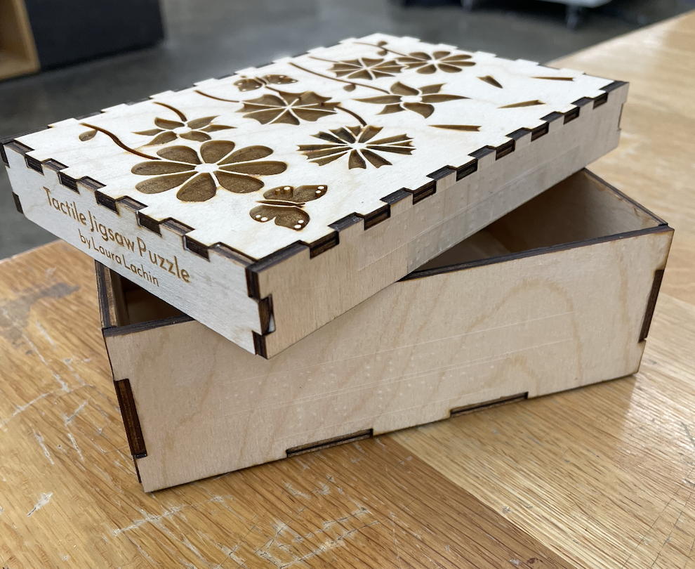
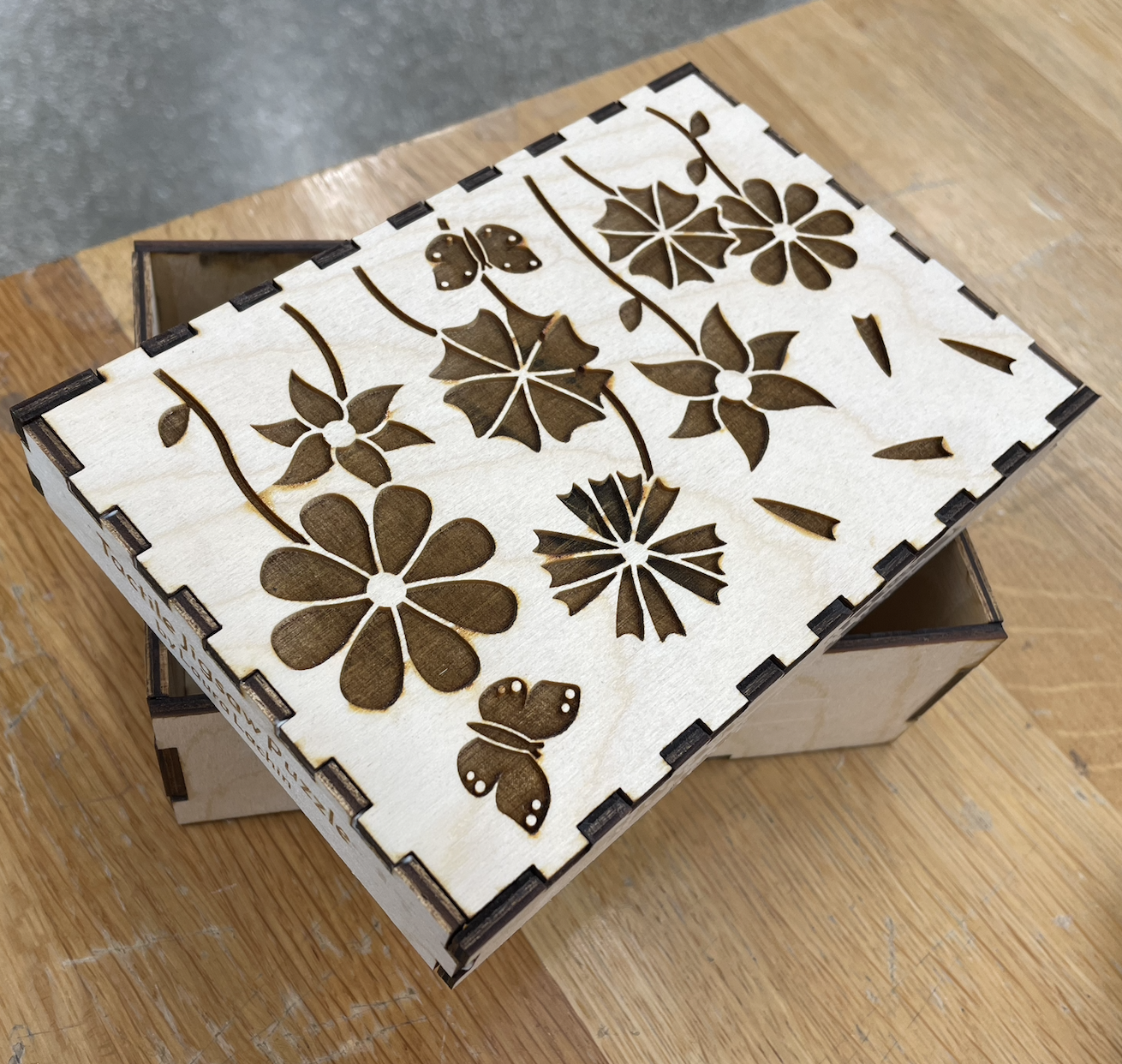
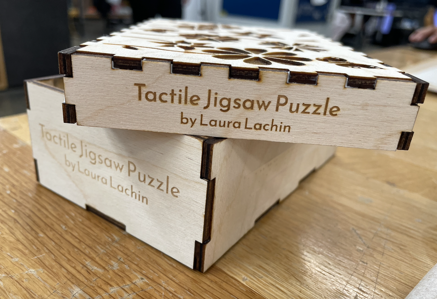
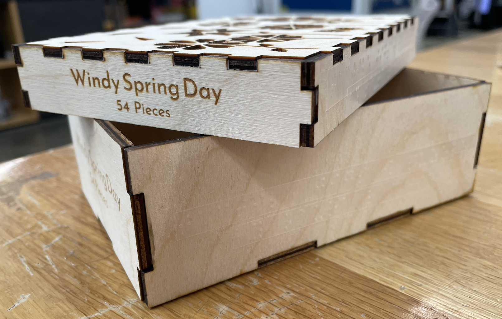
This week I cut the final versions of both the puzzle and puzzle box. In order to prep for cutting, I completed my puzzle box design by adding "Tactile Jigsaw Puzzle by Laura Lachin" to one side and "Windy Spring Day 54 Pieces" to the opposing side of both the box top and bottom. Since all puzzles, have some kind of name, I decided to call my puzzle "Windy Spring Day".
Then I began cutting, and so many things went wrong. After cutting almost everything, I realized that the new program the Makerspace recommended, Corel, had been making my puzzle smaller than intended the entire semester. I created all of my designs in Adobe Illustrator then imported them into Corel in order to laser cut them, and had somehow never noticed that Corel had been shrinking my design. So, I had to re-cut everything. This was quite a process, as the laser cutter I used began malfunctioning due to its filter randomly turning off during cutting (which can be very dangerous). As such, I tried switching to a different machine, which I also could not use as the computer would not connect to the cutter. Luckily, there was a third laser cutter I could use, which I did. After this, re-cutting everything went fine, but the entire cutting process took at least 6 hours.
After everything was cut, I glued the puzzle box piece together, then sanded the edges and tops of all the pieces. I also sanded the edges of the puzzle box once the glue had cured. Then, I sealed all the puzzle pieces with 3 coats of satin polyurethane spray.
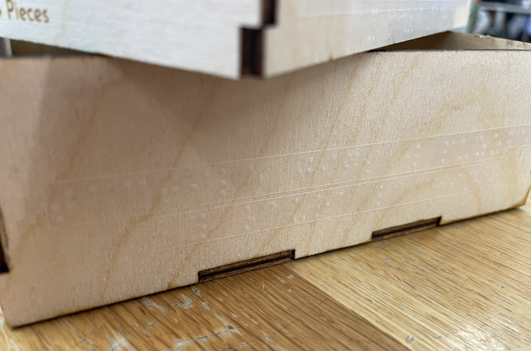
Lastly, I created Braille labels to correspond with the text on the puzzle box. I create 8 Braille labels, 2 for each long side of both the puzzle top and bottom, then carefully put them on. The labels correspond with the text on the adjacent side to the left. When placing the labels on the box bottom, I was careful to put the labels low enough so that the box top would not interfere (image below).
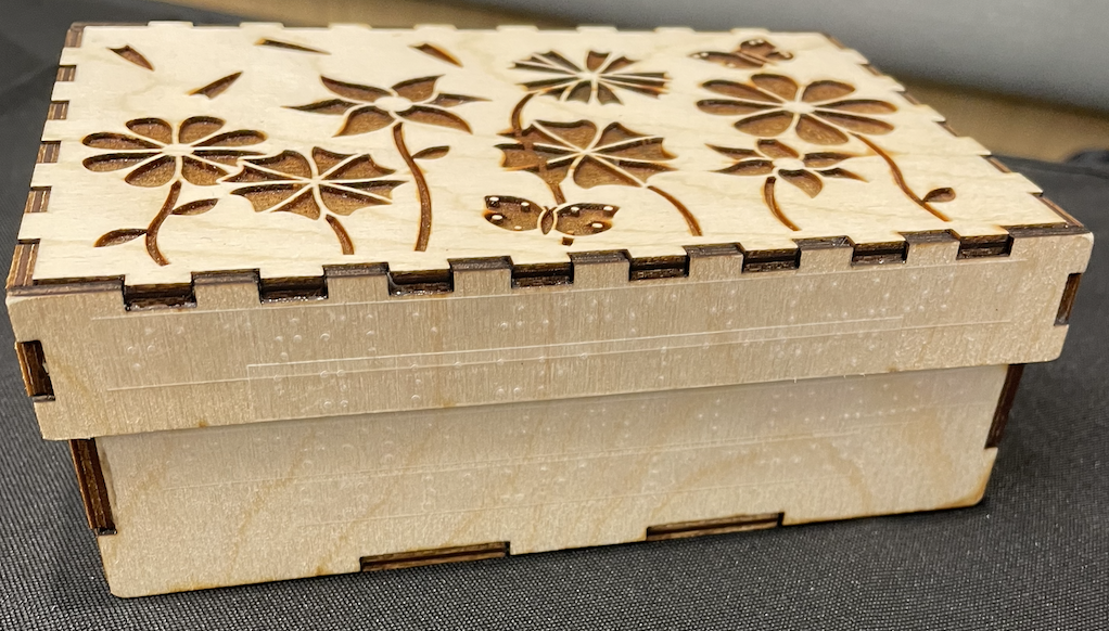
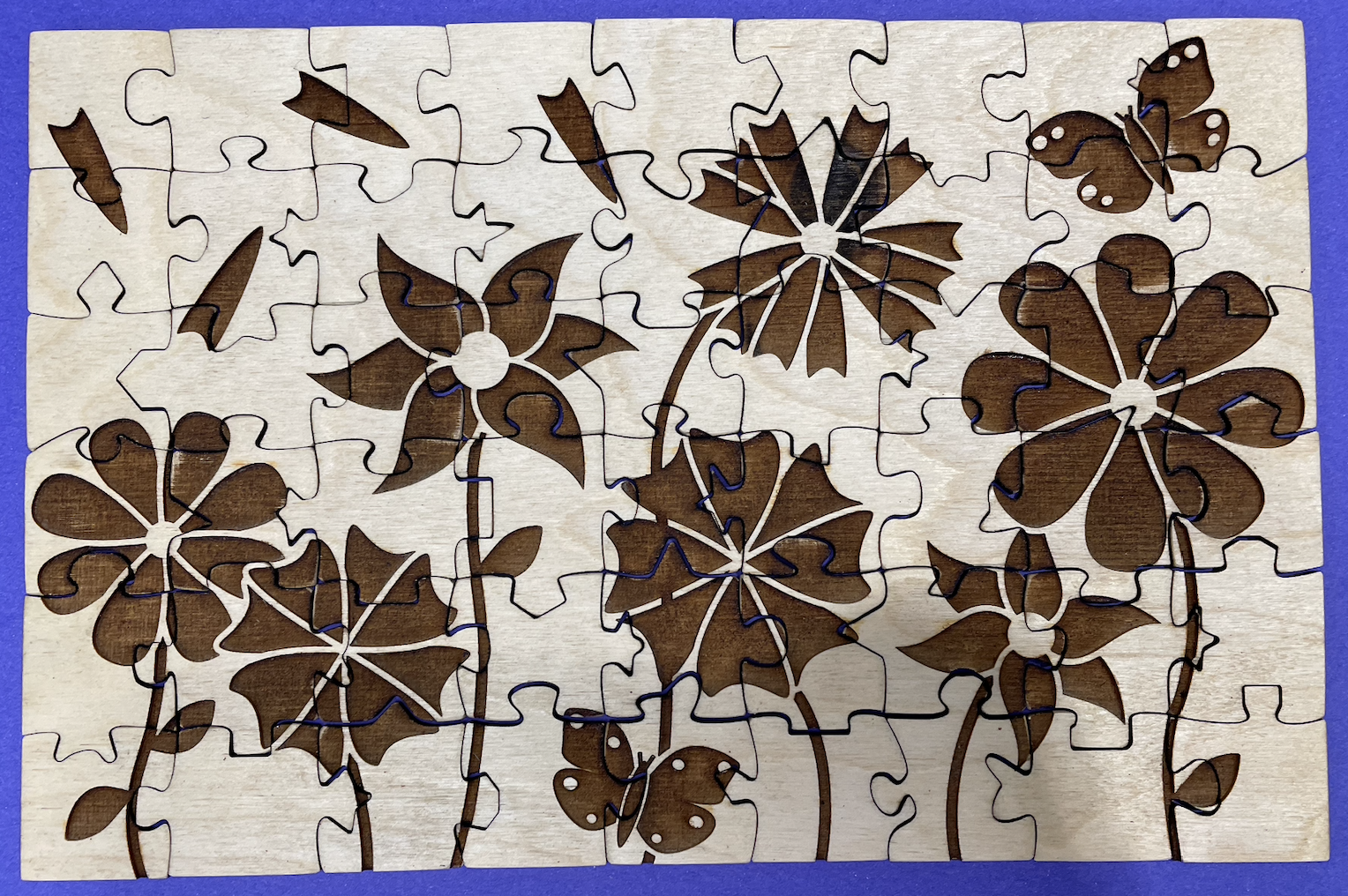
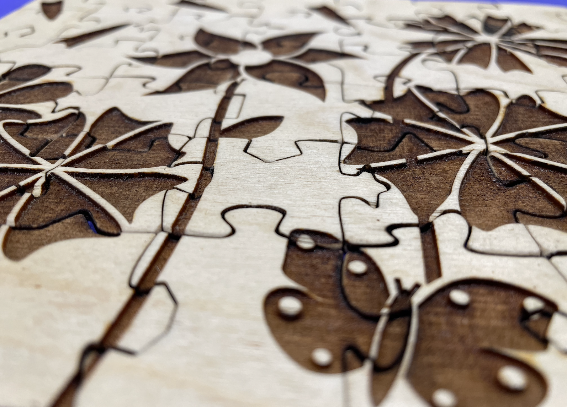
Finally, my project was complete! (images below)
April 29th
This week I tested sealing the puzzle pieces using a satin polyurethane spray. To do so, I taped four rows of pieces to a piece of cardboard, then sprayed each row with an creating number of coats (row 1 had 1 coat, row 2 had 2 coats, etc) (image below). I also sprayed the puzzle box top.
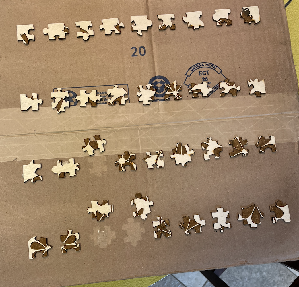
Once dry, I honestly did not notice much of a difference. The pieces look exactly the same and feel almost exactly the same. Some pieces feel somewhat smoother, but that is the only difference I have noticed. If nothing else, the pieces are likely a bit stronger now.
April 22nd
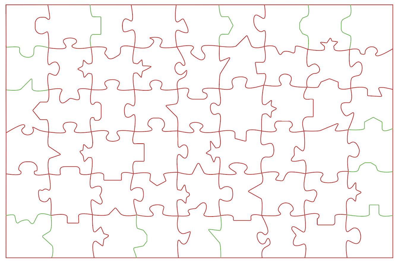
This week I adjusted some piece connectors so that the edge pieces lock together better. To do this, I first put together all of the edges pieces from my Beta prototype, then tested each connection and marked which connections were loose using Adobe Illustrator. The ones in green are the ones I needed to change (image below).
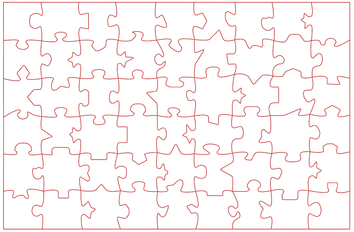
Then, I adjusted the loose connectors so thar each connector has something to 'grab' onto and stay connected (image below).
Additionally, I sanded the edges of the puzzle box prototype in order to get the top and bottom to fit together easier.
April 15th
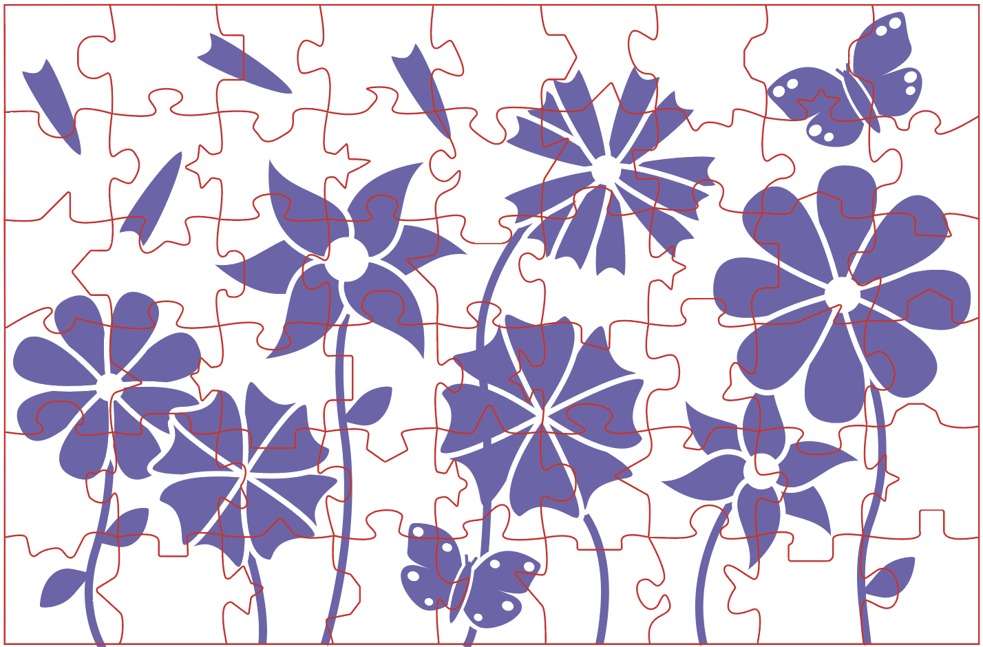
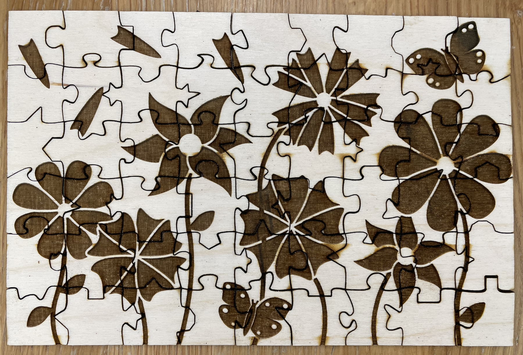
This week I finished the new top design and laser cut my Beta prototype. I also completed the Craft and Machine Learning assignment that I missed last Monday. For the top design, I added two butterflies to the places I thought were a bit too empty. Then, I adjusted everything a bit in order to avoid having any small parts that could break off after being cut (image below).
Before laser cutting my Beta prototype, I decided to try the laser cutting painter's tape trick, where if you place painter's tape in an even layer on top of the wood, it will prevent burn marks. So, I tried cutting one piece which was extremely successful, then decided to use the technique to cut my Beta prototype (image below).
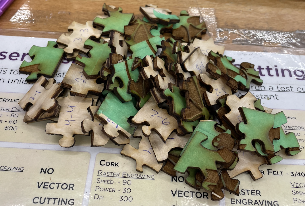
Then, I removed all of the excess tape using an Xacto knife. While doing so, I realized a few things. #1, the tape prevents almost all burn marks, but not all. I am not sure why, but I am thinking maybe some of the tape melted, was not stuck to the wood well enough, or was overlapping slightly. #2, the pieces have an interesting texture from the tape inside the etching and along the edges (images below).
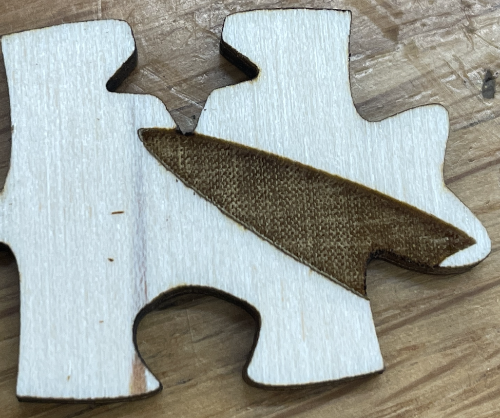
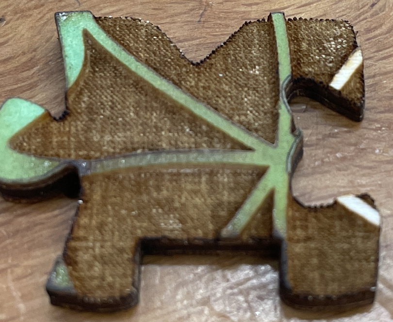
#3, some of the pieces seem to not lock together as well (image below). I am not sure if this is fitable, but one somewhat related thing I plan to do is change the edge pieces so they all lock together. Currently, many of the pieces do not lock together, making for a frustrating puzzling experience. #4, I realized I forgot to level the laser cutter bed before cutting, so the etching might not be as deep as it should be. If properly leveled, I am wondering if the etching texture will go away. If not, I do not think the texture is a problem. In some ways I actually like it more than the typical etching texture.
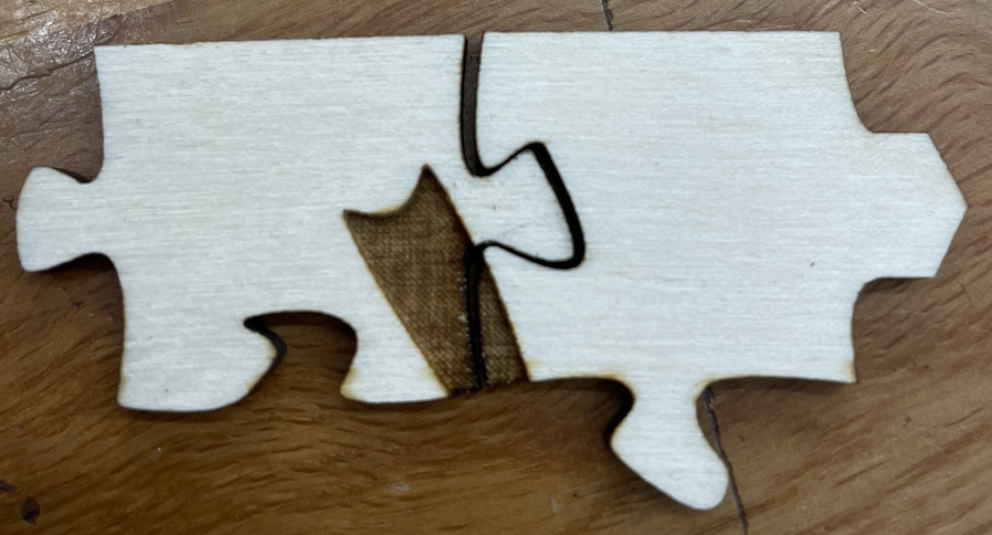
Finally, after removing all the excess tape, my Beta prototype was complete (image below).
In addition, I decided to laser cut the first version of my puzzle box. I used Makercase.com to create schematics for a basic 6" x 4" x 2" box bottom and ~6" x 4" x 0.75" box top. The box top is slightly bigger than 6" x 4" to accomodate its need to be placed on top of the 6" x 4" bottom. To cut the pieces I used the same painter's tape trick, then glued all the pieces together using wood glue (image below).
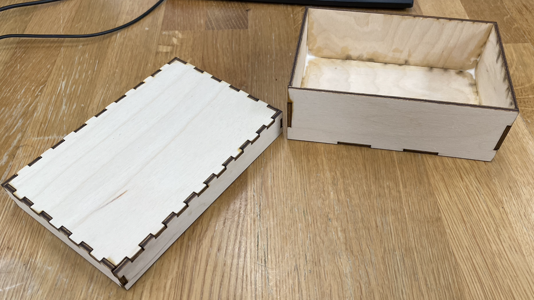
The top does fit onto the bottom, but it is very snug, so for my final prototype I am going to cut another box that has a slightly larger top.
Craft and Machine Learning assignment
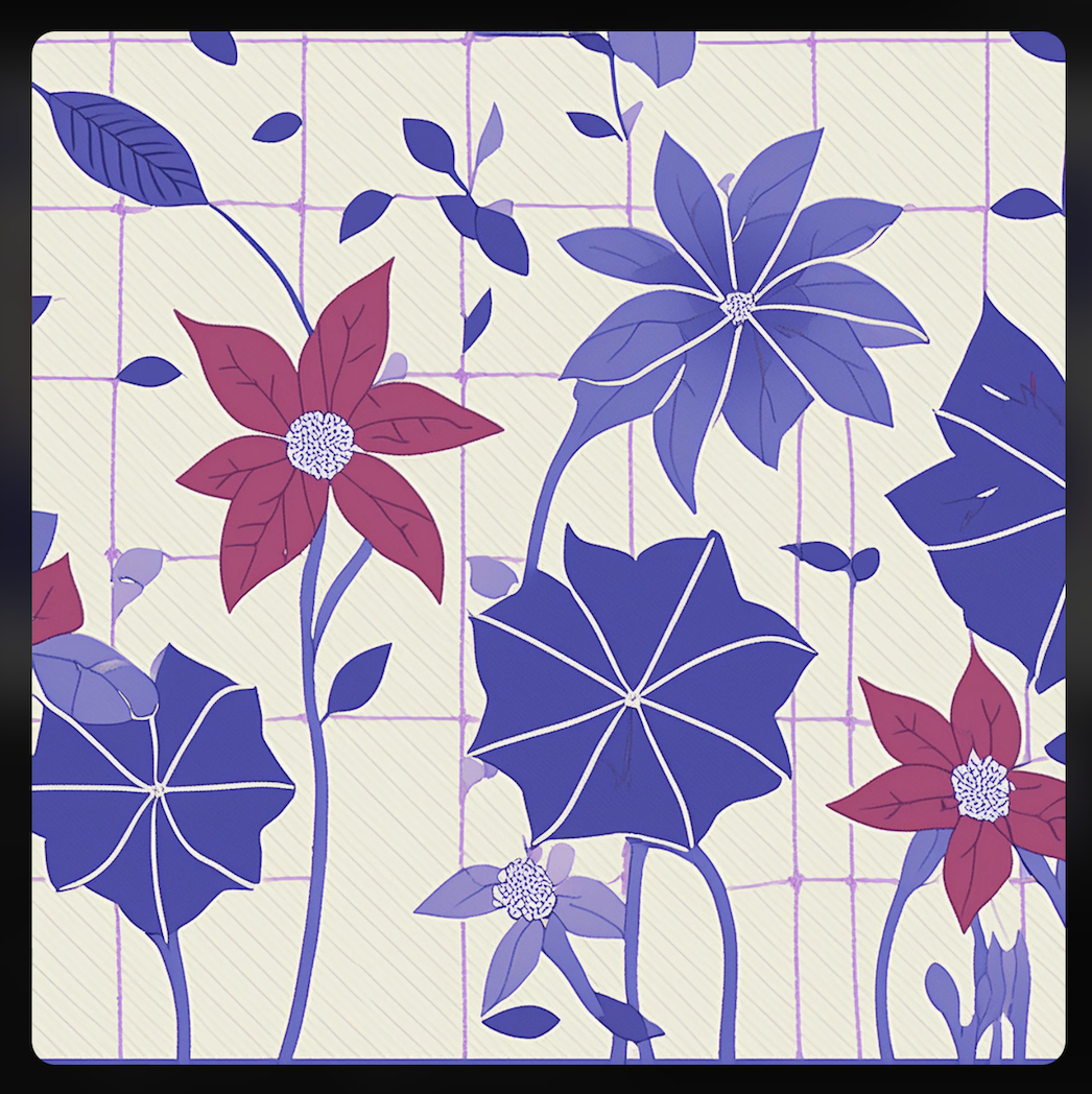
I used Adobe Firefly to create floral designs similar to the one I made, in an effort to gain ideas of how I could change/improve the design. I generated twelve images and liked this one the best (image below) because I think it could be interesting to have subtle lines in the background all going in one direction in order to help users orient the pieces.
April 8th
This week I tested sealing the puzzle pieces with Mod Podge, and it did not go very well. For my first attempt, I painted the Mod Podge onto the tops of each piece as even as possible. When dried, I could not tell that I had put Mod Podge on it at all. The texture was the same, if not worse, and the pieces looked no different. For my second attempt, I dipped the tops of different pieces into a shallow pool of Mod Podge and held the piece upside down to dip off as much excess as possible. However, not much dripped off, so I wiped off the excess with a paintbrush while also trying to leave a thicker layer than before. However, this also did not work well, as the tops were now uneven and some of the pieces no longer fit together. I will need to look into a different way to seal them.
April 1st
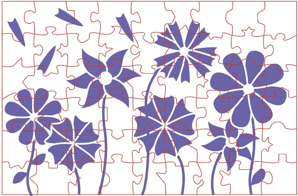
This past week I worked on creating a new top design and sanding the pieces. For the new top design, I decided to keep the floral idea but have it be more of a typical image, i.e. have flowers that are planted in the ground instead of a random floral pattern (image below). I still plan to add some more components to the design, especially to the parts where the pieces are blank or mostly blank.
For sanding the pieces, I used a 220 grit piece of sandpaper to sand half of my 20 piece midterm puzzle. I sanded the tops to remove most of the burn marks, and sanded the edges to remove any rough parts (image below). The reason I only sanded half is because I wanted to have a direct comparison between sanded vs non-sanded. The sanded pieces are much nicer to handle and still fit together fairly well, but the process was extremely messy. One of the TAs at the Makerspace said I could use painter's tape when laser cutting to prevent burn marks, so I am going to try that in order to avoid sanding so much. However, I will still sand the edges.
Additionally, this week I completed the Universal Methods of Design assignment (below) and met with my accountability team. For Riley's project, I thought it was really cool and I told her that I actually have a similar chair in my dorm room. However, I suggested that she look into adding some sort of padding to the bottom of the rocking part because, in 2022, I crushed my pinkie toe and broke it with my chair. The children using Riley's chair will likely be wearing shoes, but it could still be dangerous, especially if the child is wearing sandals or flip flops. Padding could help dampen the noise of the fidgeting. For Arden, she did not respond.
Universal Methods of Design assignment
For this assignment, I chose Participatory Design (method #61). Participatory Design is the act of including stakeholders and future users in the entire design process. This is relevant to my project because the idea of participatory design is extremely important to the disability community. The phrases "Nothing about us without us" and "Design with, not for" are common because it is vital to include disabled people in the design process when creating things for them. Unfortunately, for my project, I have not been able to work with anyone visually impaired. As such, I will likely not pursue the project further after this class until I am able to collaborate with one or more visually impaired people. I really like my project, but it would not feel right to continue without engaging in participatory design.
March 25th
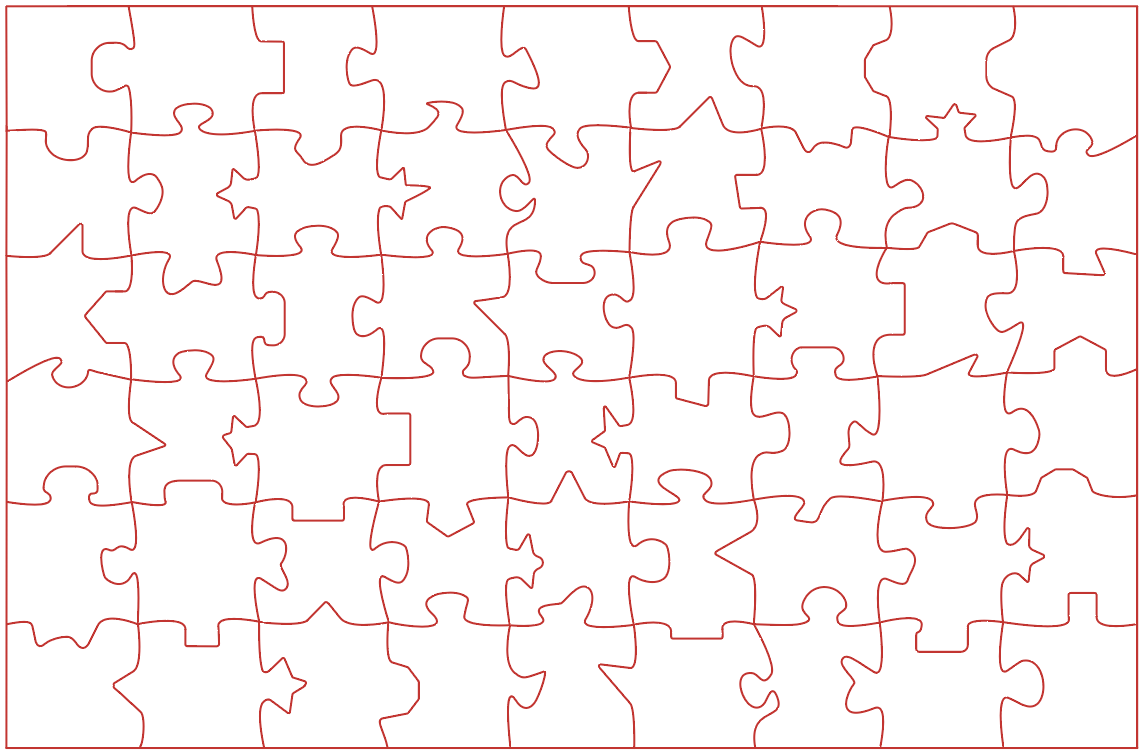
Before Spring Break, I worked on increasing the piece count from 20 to 54 (shown below). The reason I chose 54 and not 50 or 60 is because I wanted to keep a nice horizontal ratio (i.e. right now it is 9 columns x 6 rows). At this size, it measures about 10 inches by 7 inches. I hope to be able to make it even bigger, but for now, my next steps will be to work on the top design and create a nice surface finish by sanding, poly sealing, etc.
March 11th
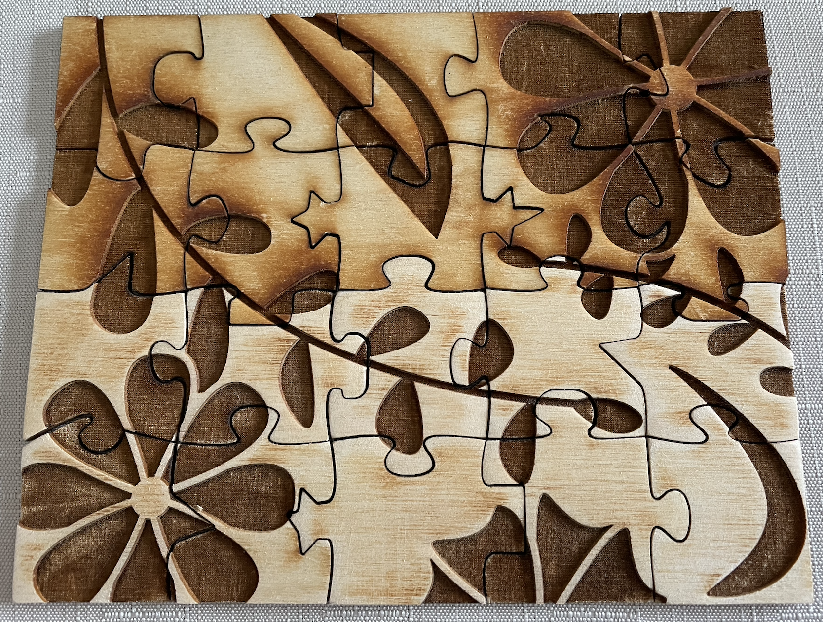
This past week I laser cut my midterm/alpha prototype. In light of the user testing last week, I made some design changes. I made the top design lines thicker, increased the overall top design size by 50%, and increased the overall piece size by 20%. I also adjusted some connectors to improve tactility and remove sharp points. Afterwards, I laser cut the 20-piece puzzle (images below). I did so using 17.5% speed, since the user testing results were split between 15% and 20%. Additionally, after laser cutting the full 20-piece puzzle, I decided to laser cut a few separate pieces in order to test using sandpaper to smooth out the pieces. I bought a 220 grit piece from the Makerspace and sanded the edges, but did not notice much of a difference. The only major difference was I was able to remove the laser cut burn marks around the design. However, I am going to look for a piece of wood with a sticker on top which will prevent the burn marks altogether.
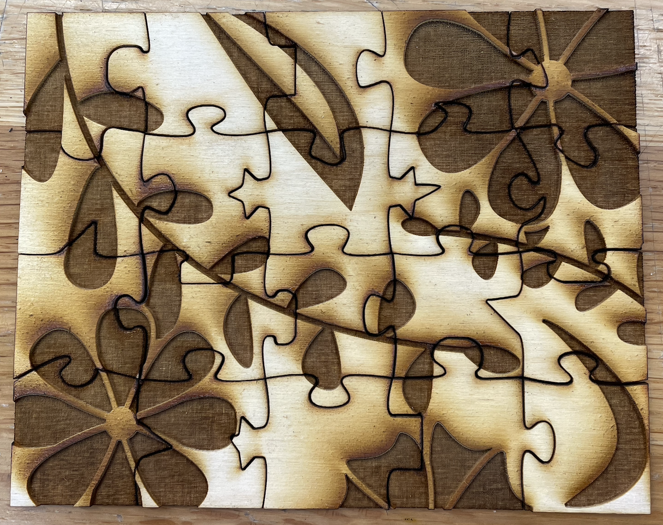
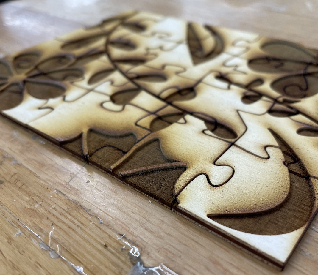
Additionally, I talked with Amy about my project in order to get overall recommendations as well as recommendations for the IDM showcase. For overall recommendations, she suggested I find some kind of puzzle difficulty document so I can better assess the difficulty of the tactile puzzle. For the IDM showcase, she recommends I just put the pieces out on a table and let people put them together. People can choose to close their eyes, but I will not promote it.
March 4th
This past week I did user testing with two participants. Both are sighted, so the testing was done using blindfolds. This is not at all as good as user testing with someone who is visually-impaired, but I was still able to get some useful information. My main goal was to find out which depth to move forward with.
For the tests, I layed out all four four-piece puzzles in front of the participants and instructed them to feel all four sets. For participant 1, I layed the sets out in order left to right from shallowest to deepest and asked them to feel the deepest first, the 15%, then move onto the next deepest, the 20%, and so on. Overall, the participant liked the feel of the 15% best because they could feel the design well. However, they could not tell what the design was and was concerned that the design was too fragile (i.e. the petal outlines). For participant 2, I layed out the sets in a different order because they had seen the order the sets were in before. From left to right, I layed out 25%, 30%, 15%, 20%. Overall, the participant liked 20% the best as they could feel the design the best. However, they also could not tell what the design was. Since participant 1 and participant 2 both picked different favorites, I took away the 30% and 25% sets and asked both participants to feel the 15% and 20% sets again, without telling them which was which. Interestingly, participant 1 now preferred 20% due to the fragility of 15%, and participant 2 now preferred 15%.
The next part of the test was to ask the participants to put two puzzle pieces together. Initially I was going to have them put all four pieces together, but I thought it might be too difficult, so I decided to do just two pieces, at least to start. Additionally, I only completed this test using the two favorites, 15% and 20%. I gave each participant two pieces of one set, then once done, gave them the other two pieces of the other set (so they individually did not put the same two pieces together, but both put together the same two pieces of each set). Both participants struggled significantly, many times thinking they had gotten it right but had not. However, their first two pieces took much longer than their second two.
I learned a lot from this user testing. First, I learned that I need to make the design's lines thicker to improve strength and tactility. Second, I need to make the design bigger so users can better tell what the design is. Third, I need to make the connectors bigger and/or make the pieces bigger, as it was difficult for the participants to tell what some of the connectors were, especially the inner connectors. Fourth, I will move forward with both 15% and 20% depth. The next step will be to laser cut two 20 piece puzzles, one that is 15% and one that is 20%.
February 26th
This past week I chose what material I am going to use. I had been debating between birch wood and acrylic, but I have decided to go with birch wood (specifically 1/8" birch plywood) for two reasons. One, it is much cheaper, and two, it is solid and not transluscent.
After deciding that, I conducted a few laser cutting tests in order to test a few things: #1, laser cut depth to ensure adequate tacility, #2, the piece edges to see if they are rough/splintering, and #3, the piece fit. The first thing I did was laser cut one piece multiple times to test tactile depth. To do so, I used the recommended laser settings then adjusted from there.
For my first piece, I used the recommended settings to get an idea of how much I might need to adjust. The piece felt quite shallow, so I decided to run the laser through again on the same piece (left-most piece in image below). This etching felt better, but it also felt rough and unpleasant, so I decided I would need to find a setting to etch the pieces nicely with just one run-through. As such, for each test, I lowered the speed slightly to create a deeper cut. The slower the laser, the longer it stays in one spot, which causes a deeper cut. The default speed was 80%, so I decided to first decrease it to 40% (second from the left in image below). It still felt quite shallow, so I decided to cut one at 30% (third from the left in image below). It still felt too shallow, so I cut three more, one at each of the following speeds: 20%, 15%, and 10% (third, second, and first from the right, respectively, in image below). 20% and 15% felt fairly good, but 10% was too deep as I could not easily feel the bottom of the etching.

After cutting all six pieces, I decided 40% was way too shallow and 10% was way too deep, so I did not move forward with them. I thought 30% was a bit shallow and 15% was a bit deep, but I decided to move forward with them for further testing. The next step was to laser cut sets of four puzzle pieces in order to test the depths on a slightly wider scale and to make sure the pieces fit nicely together. Additionally, I decided I want to do some basic user testing in order to get more opinions on the depth. Thus, I laser cut four sets of four pieces, using 30%, 25%, 20%, and 15% speed (respectively, in image below). I decided to cut one at 25% even though I did not test that speed beforehand because I wanted each one to be 5% different. When deciding which pieces to cut, I thought about just having a 2x2 grid, but decided to go for a zigzag shape to better simulate how people actually might put together the pieces in a larger puzzle.

One thing to note is that the pieces fit together, but do not lock together, which I am going to look into fixing. Another thing to note is that the piece edges felt fairly smooth. This is likely because I had to run the laser cutter two to three times in order to get the pieces fully cut out of the sheet of wood. However, the etching still felt slightly rough and was a bit fragile (i.e. could be cracked by pressing into it), so I plan to look into sealing the pieces to ensure longevity. Additionally, I decided to use digital calipers measure the etching depths to see exactly how deep they were. In my research I found that Braille is typically 0.48mm high, so I wanted to make sure the etching was at least 0.48mm deep. When taking the measurements, I tested more than one piece of each speed and tested multiple spots within such pieces. I found that there was some slight variation within the speeds, and I believe this could be due to the fragile nature of the etched wood. When I pushed the calipers into the etching, I might have dented it ever so slightly. My measurements are listed below:
30%: 0.7mm-0.8mm
25%: 0.7mm-1.1mm
20%: 0.8mm-1mm
15%: 1.1mm-1.4mm
Next steps will be to conduct user testing and look into where to buy large sheets of birch wood.
Crit Design:
I have participated in many crits in the past, all of which were related to class projects. Most of the crits were successful, such as those in Visual Foundations Studio, but a few were not, such as those in Still & Moving Images.
I greatly enjoyed the crits in Visual Foundations Studio because they were loosely structured and conversational. I believe this type of crit creates more genuine feedback - it does not feel forced. The crit sessions were also in two parts, which I greatly enjoyed. The first part was anonymous, in which everyone would write their critique on sticky notes. Everyone was given a few sticky notes and then was free to roam around the room and give anonymous critique to any project they wanted to. After this session, we would discuss each project as a group and give verbal feedback. This feedback sometimes related to the anonymous feedback, sometimes did not. If there was limited verbal feedback, the professor would give us some prompts, such as “What do you think about the color choices?”, which would typically spur a few answers. The professor would then give some feedback himself and move onto the next project.
I thought this crit structure was fantastic. I believe giving people the chance to give feedback anonymously is very important. Many people likely hold back from giving critique because they are shy or do not want to sound mean if giving critical feedback, but with this option, these concerns go away. However, this crit structure also gives people the chance to verbally give their feedback. Additionally, with the crit being in two parts, it gives people another chance to look at the project and possibly think of additional critique. This is my ideal crit structure. Overall, when receiving critique, I want genuine feedback that people have time to think about. Additionally, I want critique that people want to give, not that they’re forced to.
The critique in Still & Moving Images was a bit different. It was still loosely structured and conversational, which I like, but I do not think it was run well. The way the crit worked was we would view each other’s projects as a group then give feedback. However, the project maker was not allowed to speak much about their project before or after the viewing, which led to weak critique. For strong critique, I believe it is important for critiquers to be given some context about the project before giving feedback on it. Additionally, we were rarely allowed to respond to feedback. This overall led to a weak, one-sided conversation which was typically very helpful.
Cultural Environment:
I researched Marc Solomon, who is an Accessibility Trainer at CVS. Mr. Solomon started his journey at The Ohio State Univeristy, graduating with a BA in Computer Science and Engineering in 2004. He then went on to work at Universal Low Vision Aids Inc in Columbus, Ohio, where he held a variety of roles: Technical Support Manager, Website/Network Administrator, Trainer, and PC Specialist. In 2009, he joined Ai Squared as an Accessibility Engineer, and in 2016, he joined JPMorgan Chase & Co as an Accessibility Lead. Finally, in 2021, he joined CVS as a Senior Accessibility Designer, then moved into his current role in 2022. Since Mr. Solomon started his career in Columbus, Ohio in 2004, I tried looking up the housing market at that time but was unable to find any information. So, I looked up the current housing market for a two-bedroom apartment and found that the average price is about $1200 - $1500 per month, which seems very reasonable considering the NYC housing market.
In doing my research, I was unable to find Mr. Solomon's resume or portfolio. Additionally, I was not able to find any articles they have written/were written about them. However, I was able to find two awards they have won: The Ruth Davidson Award from the American Council of the Blind of Ohio in 2016 and the Celina E. Irby Memorial Award from The Ohio State University Office for Disability Services in 2003. The Ruth Davidson Award is awarded to a sighted citizen of Ohio "who has worked to enhance the lives of persons who are blind or visually impaired", per Mr. Solomon, and Celina E. Irby Memorial Award is awarded to an "Exceptional student employee at the Office for Disability Services", per Mr. Solomon. I was also able to find two current certifications he holds: Accessibility for Web Design and Gamification of Learning, both from Lynda.com. Additionally, I was able to find two people in their network: Karen M. Marks, Accessibility Specialist/Analyst at Mphasis, and Peter Wuerl, Senior Account Manager at Playaway Products.
I then briefly looked into three companies that I would love to work for: Lego, Amtrak, and University of Pennsylvania. At Amtrak I would apply for the Accessibility Manager role and at the University of Pennsylvania I would apply for the Web Accessibility Analyst role. I was not able to find a specific title for an accessibility-related role at Lego, but I know they have a strong accessibility department. To achieve at least one of these roles, I need to update my portfolio and likely get a few certifications, such as the CPWA (Certified Professional in Web Accessibility) certification and the CPACC (Certified Professional in Accessibility Core Competencies) certification from the IAAP (International Association of Accessibility Professionals).
Personal Manifesto:
I am an advocate. I improve accessibility.
I design for disabled people. To make them feel included, independent, happy.
I do it using my knowledge and experiences. I do it using my heart.
I do it to help disabled people do anything they desire.
I improve accessibility for a better world.
February 12th
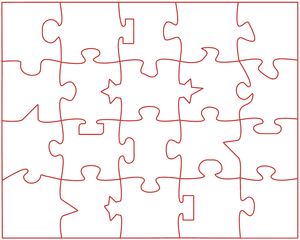
This past week I created my Low Res project prototype. To do so, the first thing I did was create 20 puzzle pieces using Adobe Illustrator, as seen below. Each puzzle piece connector is unique, meaning there will be no false fits. Additionally, each piece is approximately 1" x 1.5". When designing the pieces, I was conscious of two things: one, I tried to not make sections too thin in order to avoid pieces breaking, and two, I slightly rounded some edges and will round them more if I find they are still too rough when I laser cut my Alpha version.
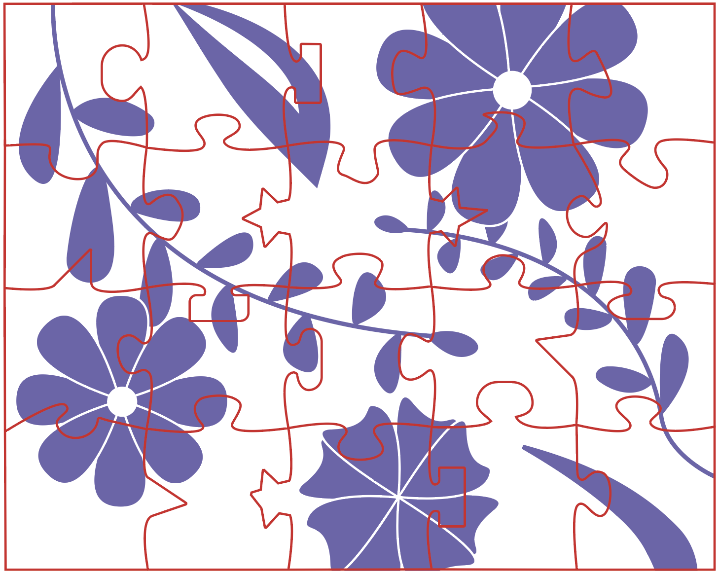
Then, I worked on creating a top design for this small prototype. I knew I wanted to do a simple floral design, so I looked up some reference photos and sketched the following design. The purple will be etched, the white will be raised, and the red will be cut through.
In addition to my Low Res prototype, I created my Personal Manifesto draft.
Personal Manifesto Draft:
"I am an advocate. I improve accessibility.
I help disabled people do whatever they want to do.
I design for people. To make them feel included, independent, happy.
I do it using my knowledge and experiences. I do it using my heart.
I improve accessibility for a more inclusive world."
February 5th
This past week I decided what to do for my project. After lots of discussions and thinking, I decided I am going to create a tactile jigsaw puzzle. Jigsaw puzzles are something that are almost entirely visual, so I want to create a version that visually-impaired people can enjoy and complete. To do this, I will be designing a puzzle that has at least two accessibility features: one will be a tactile top design, and the other will be fun-shaped piece connectors, i.e. squares, stars, triangles, et cetera, instead of just circles (very basic mockup shown below).
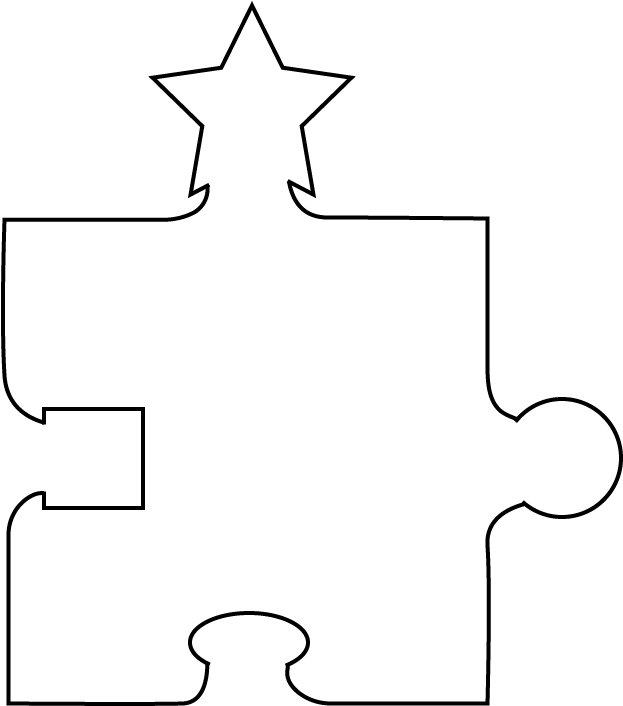
By having these features, visually-impaired people will be able to independently sort and put together the pieces. I will be making the puzzle by laser cutting wood or acrylic. Additionally, I began and completed my Project Plan v1.
January 29th
This past week I began the process of choosing what to do for my senior project. I decided I wanted to do something related to accessibility, so I emailed the Ability Project director, Amy Hurst, to inquire about some possible project I could complete for them. After emailing a few times back and forth, she and I chatted via Zoom on Friday to discuss the possible projects in further detail. I decided I wanted to do something fabrication-related, so Amy recommended I contact Holly Cohen, an occupational therapist at NYU Langone's Rusk Rehabilitation, to discuss a possible soft computer mouse project. This mouse would be designed to help those who cannot comfortably hold onto a typical hard plastic mouse. I thought this project sounded very interesting, so I emailed Holly to see if we can schedule a Zoom meeting to discuss the project further, and I am waiting to hear back.
In addition, I began and completed my Pecha Kucha presentation.